You’re going to see neutrals in a new way.

PHOTOGRAPHY BY: John Bessler; Benjamin Moore
Let’s be honest. A room that makes use of the color greige—a combination of gray and beige—probably isn’t your idea of chic, but Benjamin Moore Color & Design Expert Hannah Yeo deems the warm gray tone worthy of your attention. “Greige is classic for a reason,” Yeo says. “It’s a comfortable backdrop, especially for a paint color. You would be comfortable living with it year after year.”
While we still appreciate statement hues (hello, Pantone Color of the Year), there’s something special about a room that puts a timeless neutral, like greige, to the test. When used strategically, greige paint can have a transformative effect on a space. But before you grab your paint brush, consider these pointers from Yeo on the best way to showcase the beauty of this neutral shade in your space.

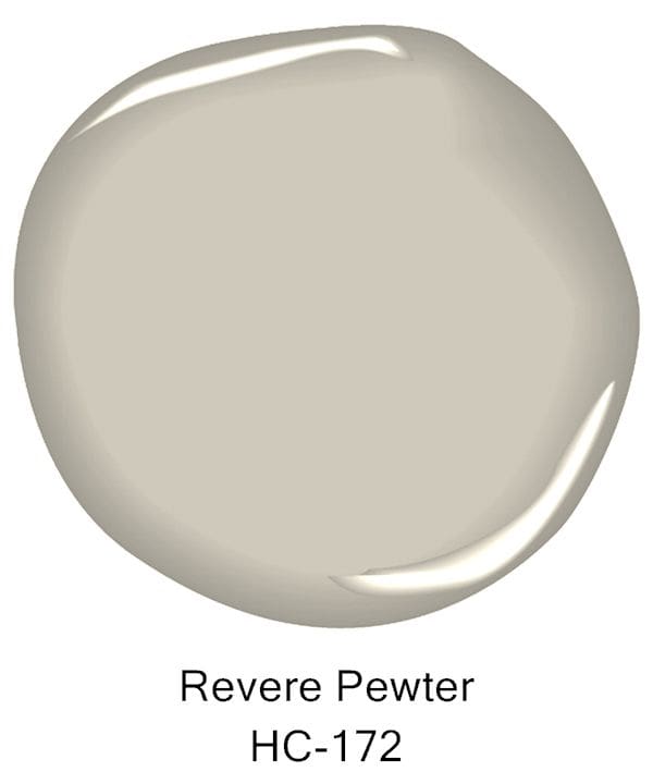
PHOTOGRAPHY BY: John Bessler/ Benjamin Moore’s Revere Pewter graces the wall of this entry.
Do’s
Embrace its versatility. According to Yeo, there really is no right or wrong way to use greige in an interior. It complements a range of architectural styles, hues, and spaces, from a nursery to a living room. One of Yeo’s favorite tactics is to pair a lighter-toned greige with a pop of color. “It can make a soft backdrop that almost disappears,” says Yeo. “It is so comforting and focuses on what is in front of it so you can add a pop of color, whether that is through furniture, an accent chair, framed artwork, or even a pattern in a throw pillow that will stand out against that soft, neutral background.”
Layer it with other neutrals. Once you incorporate greige into a design scheme with other neutrals, you can notice its true beauty. “There’s something magical about neutrals,” Yeo says. “Once you put different beiges and greiges together, you start to really see its undertone and personality in the color itself.” Plus, the simple act of layering greige with other neutrals adds depth to a room in a subtle way.
Go for texture. “The more texture—the more depth you create in the room—makes it more interesting,” Yeo says. The goal should be to aim for a balance of shiny and matte textures. If your wall has a matte finish, for example, Yeo suggests weaving in a satin fabric or patterned throw pillow. On the other hand, if you have a wall with a sheen finish, incorporate a bit of velvet or a matte fabric to juxtapose that.” This helps to create visual interest in the room and elevate the look of the space, Yeo advises.
Don’ts
Purchase paint based on a color sample. It’s not enough to rely on a paint swatch to pinpoint the right greige paint color for your home. Always test the paint in the actual space you’re working with, as the shade can take on a different nature once it’s on your wall.
Overlook lighting. Greige is a complicated color that changes under different lighting conditions. For instance, its undertones would be enhanced if a room receives an abundance of natural light, while cooler light will enhance its blue cast. “View the color in a room at multiple times a day throughout the day and see how the hue looks when it’s sunny, cloudy, or even raining,” Yeo advises.
Ignore your gut. Colors are subjective. “You know if you want a light color versus a dark color, a warm color that feels cozy and inviting or something that feels really fresh and contemporary,” Yeo says. It’s all about what suits your design aesthetic. “You know what you like, so go with what makes you happy,” Yeo says.
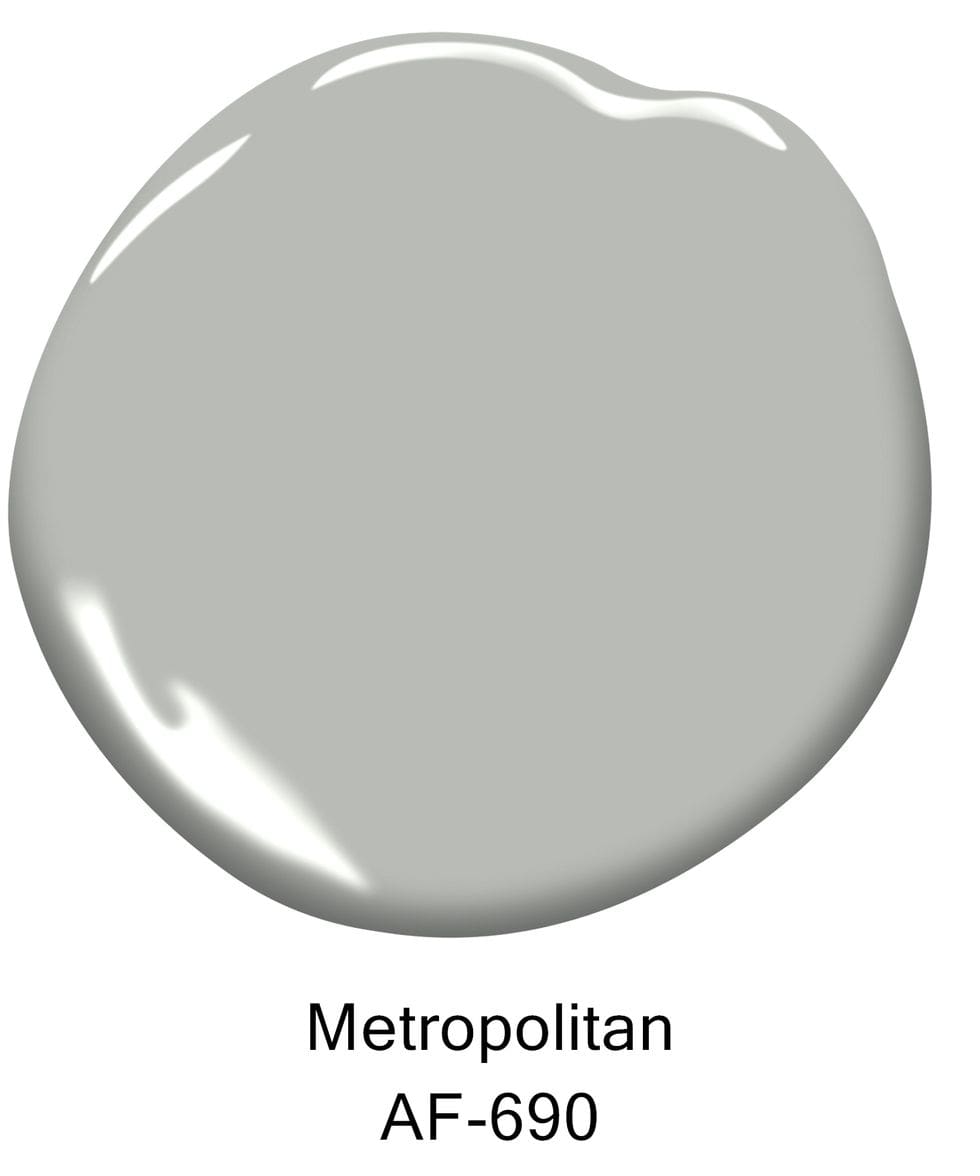
Metropolitan
This cool gray is the 2019 Color of the Year.
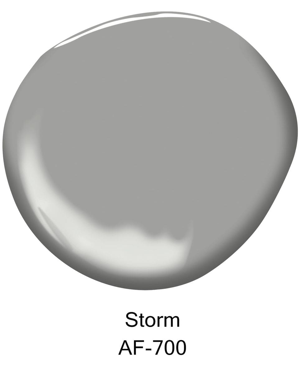
Storm
A cool gray shade with a medium tone.
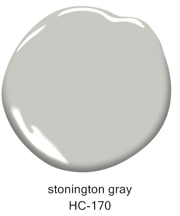
Stonington Gray
To add warmth to a room, try this stormy hue.
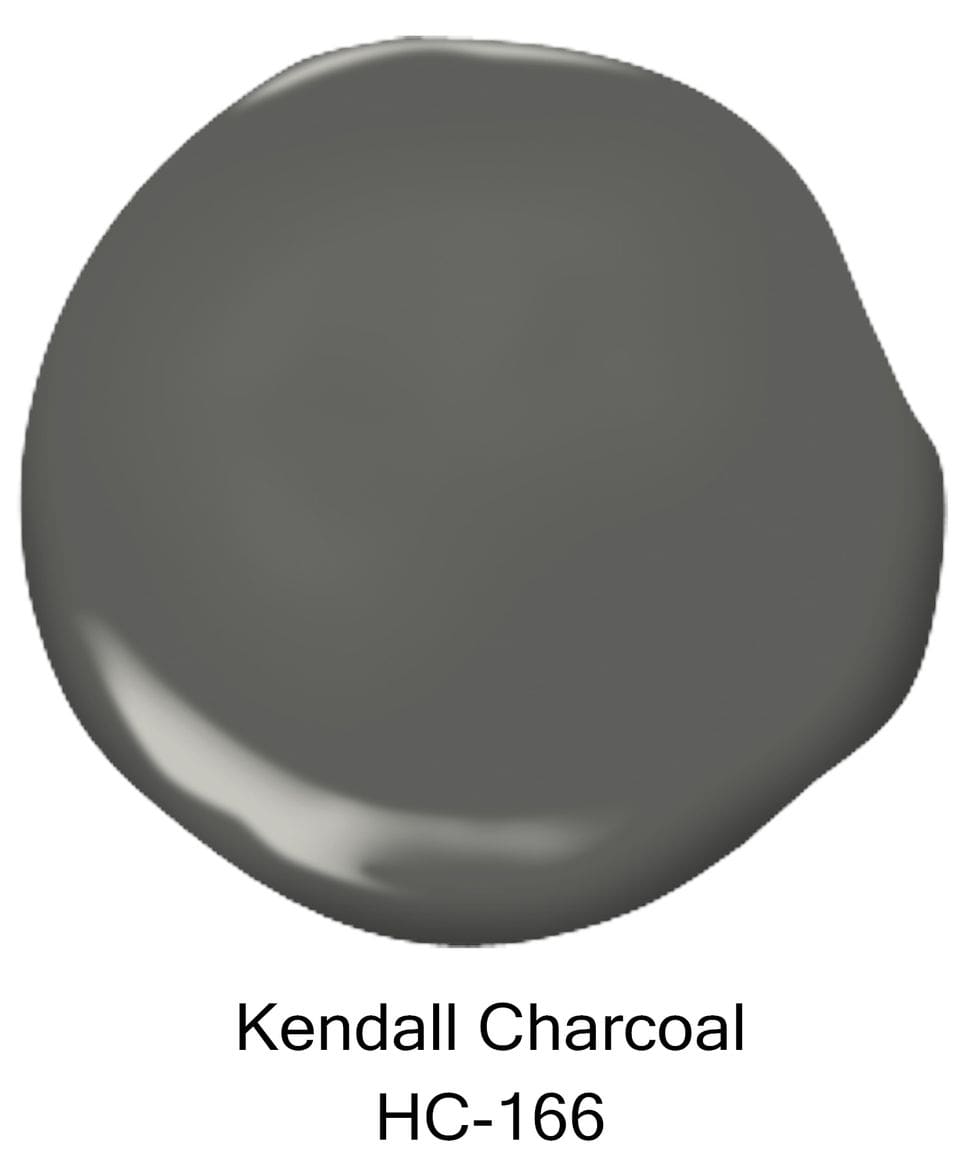
Kendall Charcoal
The perfect color to pair with white accents.